Improving Mathspace usability with learning science

For any tech product, ease of use is extremely important. It’s even more important for EdTech. EdTech usability should never get ‘in the way’ of learning. But there is a balance. There is also no point in having an easy-to-use product if it doesn’t improve student learning.
Over the last 6 months we’ve been looking at how we can make Mathspace more user-friendly for students, particularly those less confident with Mathematics, without sacrificing student learning. The challenge with this project is how to balance productive struggle with mathematics (good frustration) and unproductive struggle with learning Mathspace (bad frustration).
The Learning Science Approach
We have collected a whole heap of qualitative student and teacher feedback around what causes students to be frustrated and also quantitative metrics around student interactions with various questions on Mathspace. From this, we had hundreds of ideas for features we could add to make things better. They all seemed like good ideas, but where do we start?
Prioritization is the hardest part of building an ambitious product offering with limited resources. Historically we had used things like voting, user surveys, impact vs effort charts to limit our features to those we felt might have the biggest impact. But with hundreds of ideas we would leave so many on the table unexplored while we worked on a few that we felt best about. We wanted to be able to test out more ideas quickly, discard those that weren’t looking great and invest more in building those that looked to be working.
We wanted to take the data-driven, scientific approach we advocate for teachers to implement in their classrooms. So being a learning company filled with mathematicians we adopted an objective way to test out more features faster and then release the ones that worked.
The process
- We developed a series of metrics to measure student learning and student frustration using both qualitative and quantitative feedback.
For example, if a student repeatedly enters a step multiple times then that indicates some unproductive struggle with that question, whereas if a student gets a step wrong, uses a hint and then gets it correct then that’s a productive struggle.
2. We then designed a series of experiments to test if we could:
- Reduce frustration without reducing learning
- Increase learning without increasing frustration
3. We released these experiments to a subset of students and compared the results against a control group in a process called A/B testing. If an experiment passed the criteria above (with statistical significance) we released it to all users with certainty that it works.
Case Study of an Experiment
Showing Hints automatically when a student is on the verge of frustration
From reviewing our data we saw that there were many students who were resistant to using hints to help them solve a problem, even though hints would not affect their score. We saw that many such students ended up frustrated and giving up without ever using a hint.
We wanted to test to see whether we could reduce students exiting an assigned task and also improve student learning. We developed an early version of the feature very quickly, paying little attention to polishing the experience. We then turned the feature on for 10% of our users selected randomly. The early results are shown below:

You can see that compared to the control group, this feature:
- increased correct final answers by 2.1% on average
- reduced frustration (measured by multiple incorrect steps or repeat inputs) by 6.4% on average
- increased positive sentiment on problems (i.e votes) by 22.5%
The graphics illustrate the spread of the data among users which allows us to determine the statistical significance vs random variation.
You‘ll also note that we’ll need more data to confirm the increased positive sentiment is of statistical significance, but early indications are that this experiment is a winner. We therefore decided to invest design and engineering resources to polish the feature so it was more user-friendly and robust enough to scale to all our questions while we continue to collect more data.
Importantly, this scientific approach does not mean we ignore qualitative feedback. From our user interviews we found that even though we could objectively say the auto-hint feature was helpful for most students, many of the students who used hints well, found it a bit intrusive. Our design team was then able to include an option for students to turn it off.
The end result can be seen in action below.
And this is not the end of it. We will continue to monitor to see how many students have toggled the auto-hint feature off and what the affect is for them on learning and frustration.
What else are we experimenting with?
We are very excited about the pace of innovation we can drive with this learning science approach to iterations on the student experience. We’ve run over a dozen experiments now in the last 4 months alone and have made a number of releases that have had a huge impact on student learning or reduced frustration
Some highlights include:
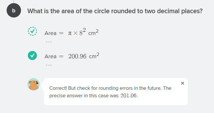
- Providing Leeway when students’ rounding is slightly out, while alerting them to the more precise answer
- Providing an automatic hint when a student repeatedly enters the same step (even if correct) to short-circuit frustrations
- Providing an alert when students forget the brackets for coordinates
- Providing an alert when students enter the correct answer but not in equation format
- Displaying hints alongside requested Next Steps
- Displaying videos, lessons and worked examples side by side with the problem students are working on.
What next?
For too long EdTech resources have been pitched as a silver bullet to improve student learning outcomes, but our experience is that’s just not the case. It’s a series of incremental improvements over time that compound to make a big impact over time.
With this learning science approach, our metrics confirm that we have made some significant improvements to make learning easier and more enjoyable for students on Mathspace. Importantly for each of those ideas that make it to the product there are currently 3 or 4 ideas that don’t make a big enough impact and so are discarded. We’ve been ramping up to the stage where we can run 2 or 3 experiments each week and so over the course of a year we hope to test 100-150 ideas and expect you to see the top 20-30 ideas to make it through. So rather than find that one big unproven idea that’s going to magically fix student outcomes we’ll continue to make those proven improvements 1% at a time.