4 Ways to Address Disinformation in the Mathematics Classroom
Here are some ideas on how math teachers can provide opportunities for their students to develop as critical thinkers and intelligent evaluators of the content they consume.

I recently came across a fascinating article from EdWeek on how teachers are combatting disinformation in their classrooms. Along with coronavirus, disinformation had to be one of the words of the year for 2020, so it was great to see some tangible actions that teachers can take to help arm their students with the tools to be informed citizens.
One thing that stood out to me though was that the article focused mainly on the civics and social studies classroom. While the connection between social studies and disinformation is clear, I believe that all teachers can and should find ways to give their students the skills to navigate the world of news and social media.
As a former math teacher, I'm going to focus specifically on how math teachers can provide opportunities for their students to develop as critical thinkers and intelligent evaluators of the content they consume.
Let's have a look at ways to do this, and then I'll share some information on a more detailed project you might want to try with your students.
How to start this conversation in your class
The four ideas I'll address are:
- Critically Analyze Data Visualizations
- Understand Correlation and Causation
- Explore the Raw Statistics Beyond the Headlines
- Challenge the Likelihood of a Statistic
Critically analyze data visualizations

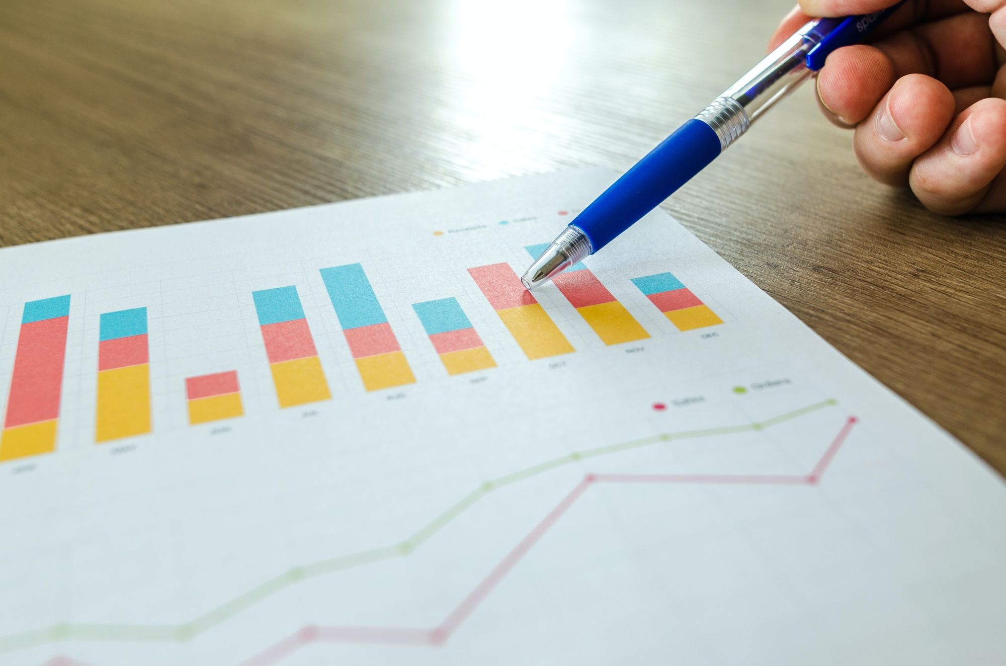
For those who have seen my previous posts on LinkedIn, you know I'm passionate about data literacy. Get your students to analyze what a graph and is showing, and sometimes as importantly, what it's not showing.
Facilitate discussions with your students on what they can see when they look at a graph. Is the scale consistent? Is the type of visualization appropriate for the data being presented? Is there any missing data? Ask students to share their findings, and encourage them to create their own graphs. A great activity is to give students a data set (or have them choose one of their own) and create two graphs. One of the graphs should be as honest and transparent as possible, while the other should attempt to mislead the viewer.
There are some great resources available online that provide examples of poor of misleading graphs. I've shared a couple below.
- Misleading Graphs and Statistics (from Arkansas Tech University)
- Real Life Examples of Misleading Graphs (from Statistics How To)
Understand Correlation and Causation
Ban Ice Cream Trucks! New study shows that when ice cream sales increase, so do drownings!
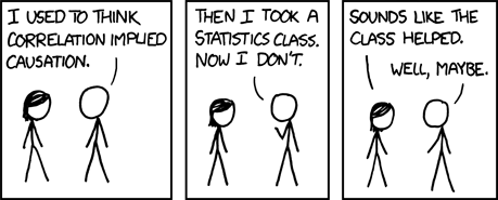
Correlation and causation have to be one of the most misunderstood but important concepts in data and statistics. Two variables might be related, but that doesn't necessarily mean that a change in one variable directly causes a change in the other. In the sensational headline about ice cream and drowning above, the statement could very well be true. However, what do ice cream sales and drowning have in common? Summer. There is a hidden third variable at play that more directly influences both variables. When it is summer, people are more likely to buy ice cream. Also when it is summer, people are more likely to go swimming, and sadly, therefore, to drown.
If two variables seem to be related, there are a few possible reasons beyond "A causes B"
- There is a third variable impacting both A and B (like the ice cream example)
- B actually causes A
- A and B are interdependent
- It is a coincidence
A great activity here is to give students the opportunity to choose a pair of variables that have a strong correlation, and try to determine whether there is causation involved as well.

Explore the Raw Statistics Beyond the Headlines
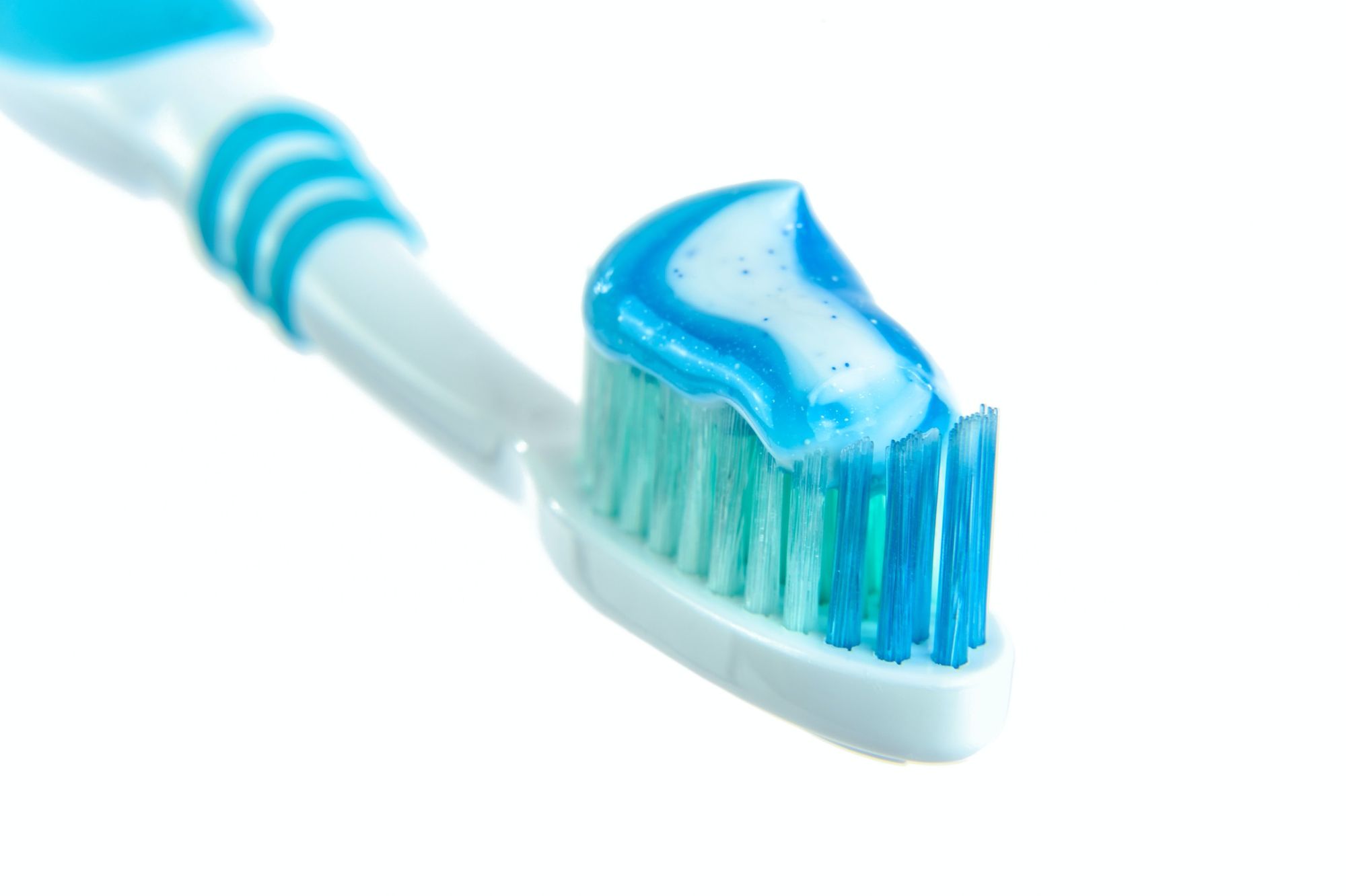
90% of dentists recommend brushing with nothing on your toothbrush!

That makes for a pretty shocking, and probably worrisome, headline. Instead of taking this at face value, encourage students to dive deeper into how that statistic could have been generated. The conclusion itself may be true based on the data collected, but the collection methods could be suspect.
Ask your students to think about how they could frame a survey to create a result like this. In this example, you could ask 10 dentists who lost their medical licenses due to malpractice. This might provide a response rate of 90% who say brushing with nothing is better. Alternatively, another way of influencing the responses is by how the survey question is framed. You might ask dentists "Which is better? Brushing your teeth with icing sugar, or with nothing on your toothpaste?" In this case, most dentists probably would recommend brushing with nothing.
The conclusion here is that a statement can be true, but that doesn't make it meaningful.
Challenge the Likelihood of a Statistic
Contrary to popular belief "I read it on Facebook, so it must true!" is not in itself true. The same thing is true about any form of media. Whether it is through a deliberate attempt at deception or an honest mistake, sometimes things get published that are just flat out wrong.
I need to share a small mea culpa here. In the last article I wrote, on vaccine efficacy, I initially shared an incorrect formula for calculating the efficacy. It wasn't intentional, but it was there nevertheless. Thankfully, a few wonderful readers called me on it, and pointed me in the right direction. I was able to make the correction, and made a note in the article that I had changed something.
Encourage your students to approach statistics with a skeptic's eye. If something feels too good to be true, or unbelievable, maybe it is. Ask your students to scour the internet and find something that they believe to be untrue. Once they have done so, they can use the strategies discussed previously to dive deeper and try to either confirm or refute their solutions.
Descriptive Statistics Project - Statistics in Advertising
Full credit for this project goes to one of colleagues, Linda Esposito.
As a warm up, ask students to consider the following statement
100% of female students at a particular university married a former professor from the university
Ask the students what conclusions they might draw from this, and also what further questions they might have.
After discussion, add some more context to the statement, by telling students that "the school in question only ever enrolled one female student -- and that the student happened to connect with a faculty member and marry him, over a decade after graduation"
How would that change their conclusions? What further questions might they have?
Finally tell the students "The statistic in question was published in a school magazine that sought to maintain the tradition of excluding women from attending this formerly all male college"

How does this change things? This final piece also brings in the importance of understanding the source of your information, and how they're motivation might impact what data they share and how.
For the actual project, have each student (or group) create and present an advertisement that uses valid statistics to try and influence their audience. The job for the rest of the class is to ask follow-up questions to try and discern the context and draw more accurate conclusions. For all students, the quality of their follow-up questions and probing is considered a part of their project just as much as the advertisement itself.
I hope this is been a useful exploration into how math teachers can make real world connections to disinformation for their students. Feel free to share your thoughts or ideas in the comments below.

